
TCC #52 — Designing to mislead
When designers jump on the greenwashing bandwagon

Words are powerful, but images are far more so. Writers can change the world, but designers make it functional, liveable, inspiring. Good design can inspire movements, change human interactions, and even save lives. Bad design can cause light confusion, send you into the wrong public bathroom, or lead you to believe things that are absolutely untrue — all without saying a word.
Designers know this. Most want to optimize for a nice mix of creative and functional, getting the right message across without being overly bland.
But what happens when greenwashing-prone marketing and PR teams rope designers into their schemes?
In Meg’s and my recent analysis of the 100 largest companies’ sustainability reports (to be released soon, when we emerge out from under our pile of client work), we saw some pretty disappointing instances of design employed not to bring clarity, but rather to obscure reality.
Here’s a high-profile example. By now, most of us know that Microsoft’s emissions exploded last year thanks to its energy-hungry AI models. A big spike in emissions is a problem, but ignoring a big spike in emissions would be a bigger problem. Hats off to Microsoft, because they did just that.
Take a look at this neat little table where Microsoft shares its ‘progress’ on emission reductions. Scope 1 and 2 went down, so that gets a green tick.
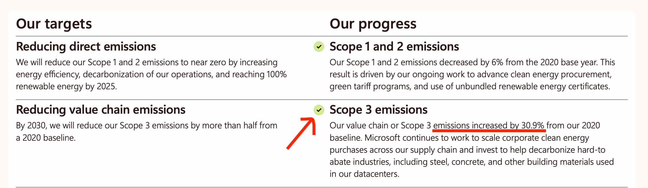
Microsoft does not explain how they will address this enormous spike in emissions other than what’s provided above, even though a 31% increase in Scope 3 (the source of the majority of their emissions) is an enormous setback for their ambitious climate goals.
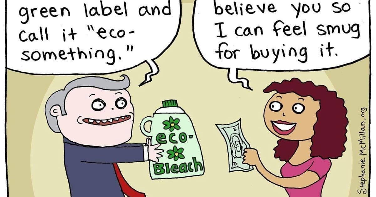
Beyond sustainability reports, dirty designs, as I’ll now start calling them, are rife in the world of environmental marketing.
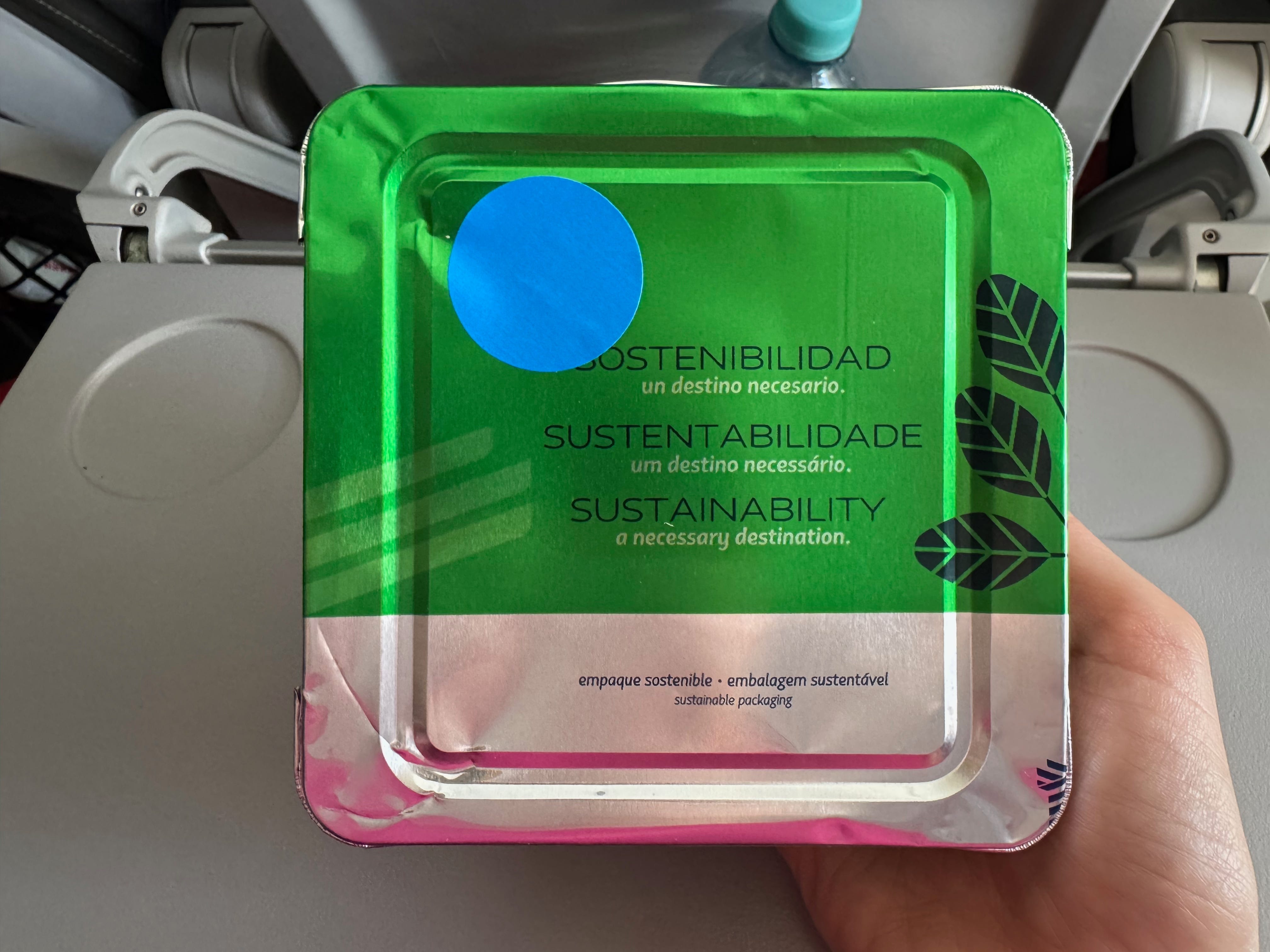
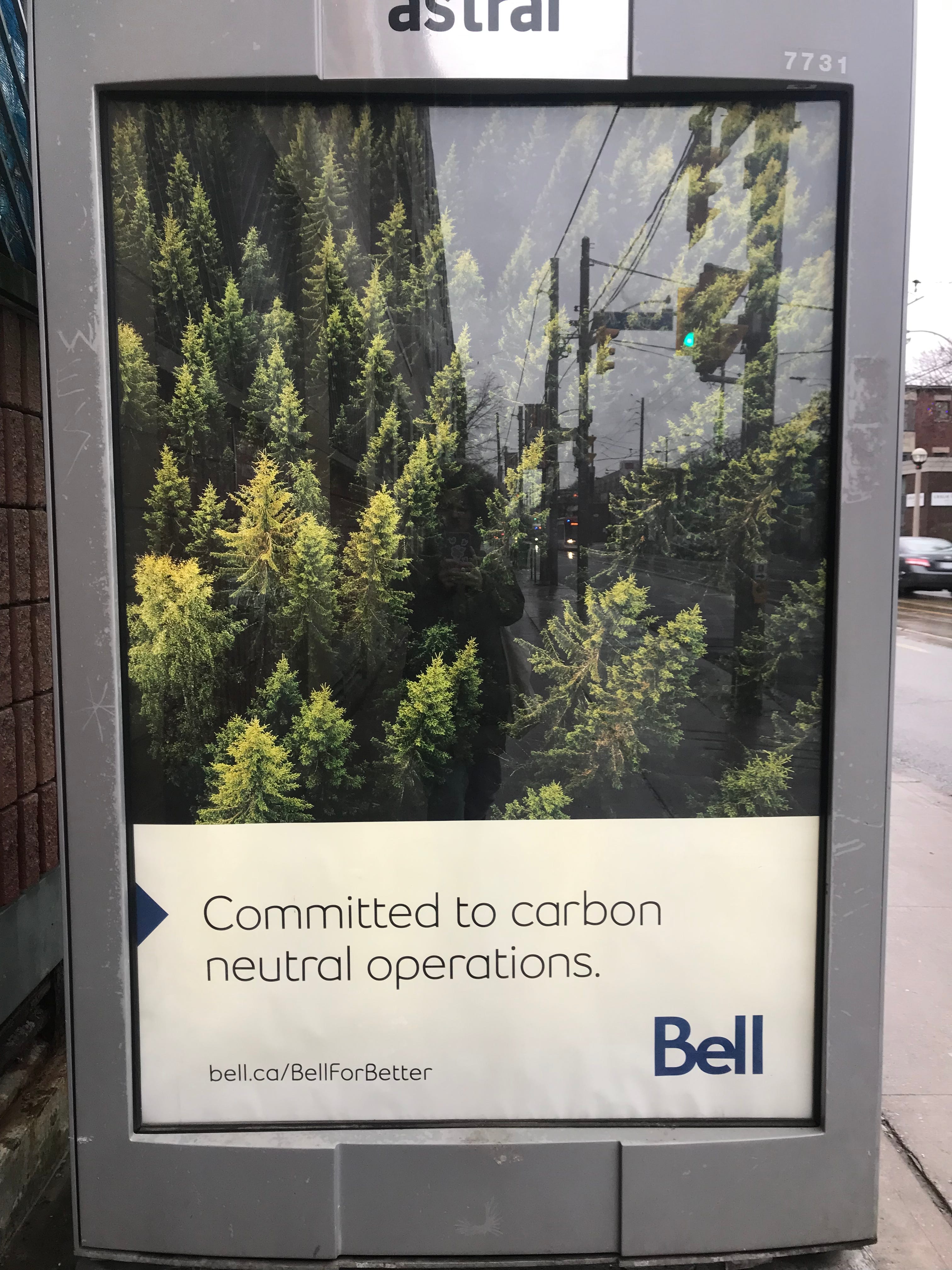
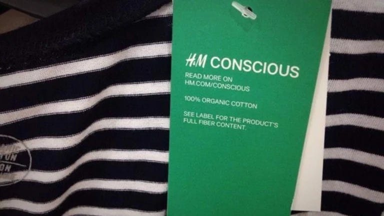
Marketers just love to splash the colour green on any label or package they can, or employ a subtle leaf motif (even when the subject at hand has nothing to do with trees), or, when creative inspiration dries up, stick a photo of a forest on a billboard.
It’s even more tempting to greenwash through design than it is through images because it’s easy to hide behind. When your supposed environmentalism is made implicit rather than explicit, it’s a lot harder to be called out for it.
But, of course, this is marketing. In 2025, most of us don’t trust claims made in paid ads, and increasingly, we’re starting to doubt these supposedly ‘official’ reports they’re putting out, too.
Instead of being reliable documents that accurately report on sustainability progress (good and bad), sustainability reports appear to be more an exercise in PR than anything: exaggerate the good and simply ignore the bad.

I think my takeaway is pretty simple here.
Climate and the environment are enormous, complex issues. Climate action comes in many forms. When we continually rely on one colour, a handful of clichéd symbols, and the same forest/ocean/seedling-growing-from-cupped-hands stock photos over and over and over again, our message starts to lose its meaning.

The bad guys use these clichés intentionally, but we don’t have to.
There’s so much potential for design to help our audience understand the full breadth and complexity of sustainability concerns and solutions. There are so many more colours than green and so many more climate solutions than trees.
Let’s think bigger.
This post is based on an extract from The Climate Hub’s upcoming report, The 2025 Sustainability Reporting Landscape. Subscribe to our Substack to be notified when it is released 👍